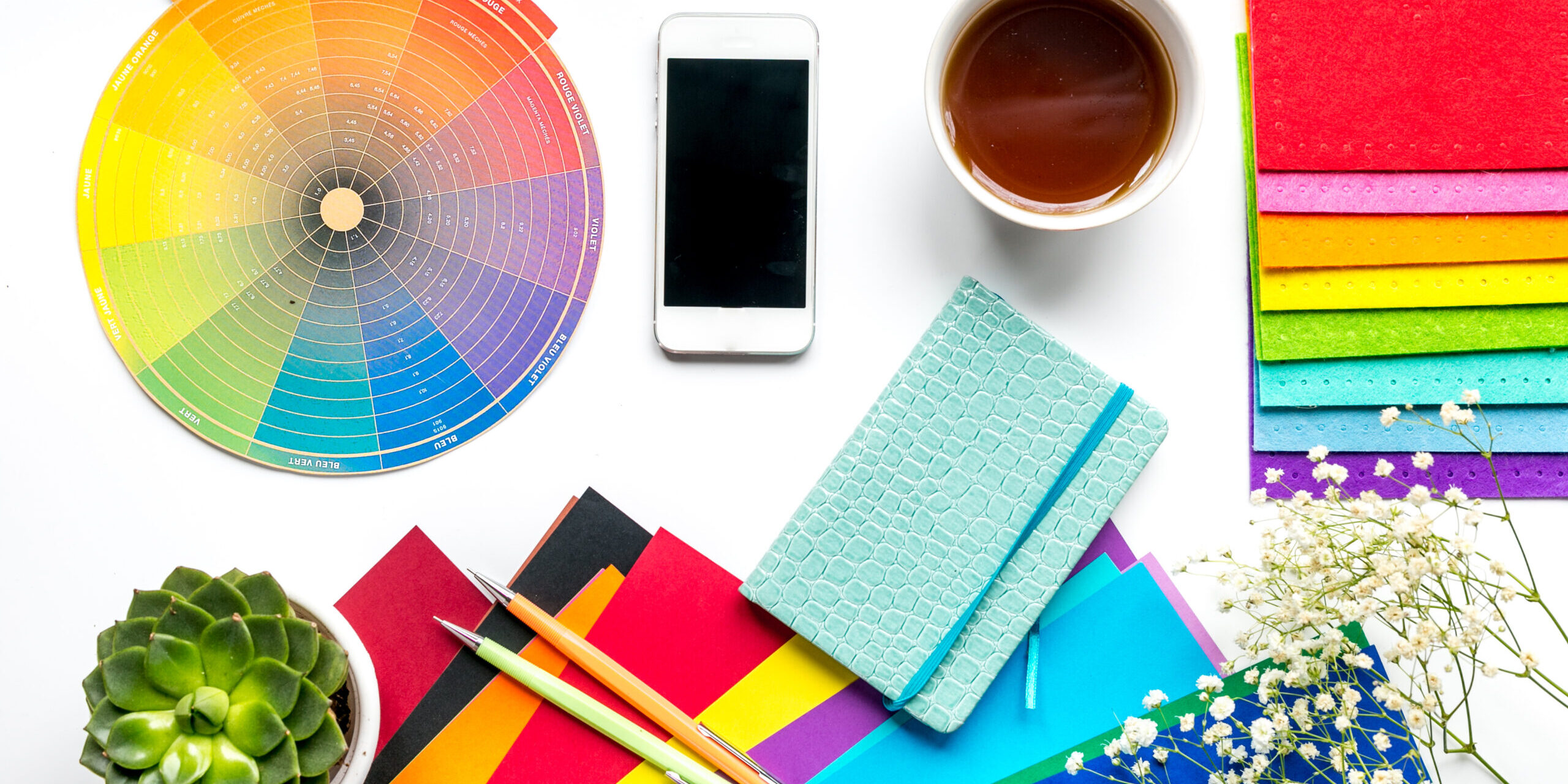
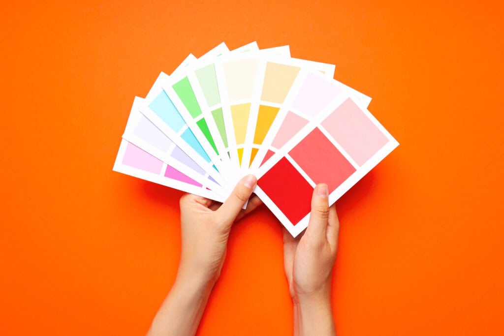
“Understanding the psychology of color and which hues will best suit your brand ensures your company stands out for all the right reasons.”
A brand identity that resonates with your target audience and creates brand equity requires more than a color. It demands the ideal visual representation of your brand’s positioning, personality, and values. That’s a lot to ask of ROY G. BIV, yet it’s crucial for your business’ success.
Don’t underestimate the power of color when creating or refreshing your brand identity. Research shows that 93% of consumers consider visual appearance to be the deciding factor in their purchasing decisions. Some brands have even trademarked their iconic colors—think Tiffany & Co.’s Robin’s egg blue, Post-it’s sunny yellow, and T-Mobile’s hot pink. Understanding the psychology of color and which hues will best suit your brand ensures your company stands out for all the right reasons.
Choosing the Color that Speaks for You
Don’t throw a dart at a color wheel or choose your daughter’s favorite color. Though those are fun ideas, there are better ways to increase brand awareness and nail down your brand identity. When choosing the color that visually represents your company, take these steps to ensure your success.
- Understand your brand’s spirit. That might sound a little woo-woo, but have you taken the time to consider who your brand is? How would they act as a person? The emotions you want your brand to convey are significant in the color you’ll want to use. For instance, if your brand is light-hearted and fun, black is not the color for you. It will confuse your potential audience.
- Define your audience. This step is vital! Have you written customer personas? If not, now is a great time. Create semi-fictional descriptions of who your buyers are, what they want, cultural nuances, etc. Who should you cater to, and do colors mean something different to them?
- Study your competitors’ color choices. Do your competitors all lean to the same color palette? You may consider taking a risk to stand out, providing your color doesn’t represent the opposite of your intention.
- Talk to experts. Skipping this step will do your business and brand identity a costly disservice. Invest upfront to save money in the long run. Brand agencies exist to ensure companies thrive, establishing identities that last and personify your values and positioning. Their expert understanding of color psychology ensures you find the perfect color combination.
“Creating the perfect feeling for your target audience is the difference between building brand equity and never establishing it.”
Unboxing Color Psychology
Color has the power to evoke strong emotions—good and bad. Creating the perfect feeling for your target audience is the difference between building brand equity and never establishing it. Ensure you consider the cultural nuances of color and how they don’t represent the same thing to everyone.
The meaning behind the shades…
Red
Passion and love, urgency and intensity. Survival, alertness, and safety. Hunger and appetite.
Other connotations: Pain, aggression, defiance, and danger.

Yellow
Encourages communication and increases cheerfulness. Represents optimism, youthfulness, and clarity.
Other connotations: Sickness, fear, cowardice, and depression.

Blue
Curbs appetite and represents serenity. Creates a sense of security and trust in a brand. Common in health-related organizations.
Other connotations: Cold, depression, and sadness.

Orange
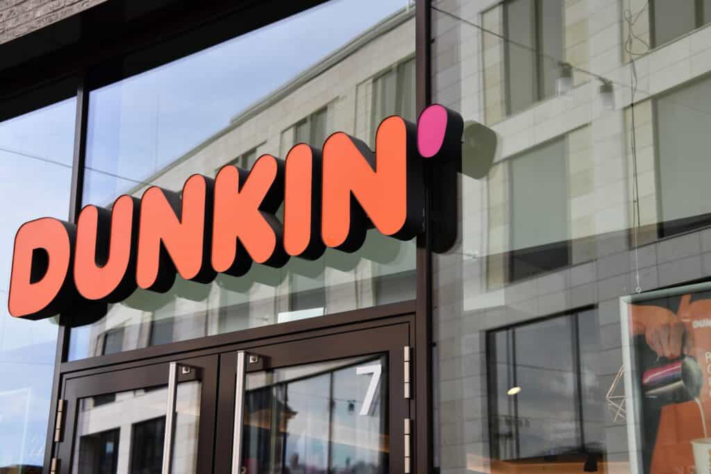
Inviting, creative, and bold. Enthusiastic and welcoming, warmth and easy confidence.
Other connotations: Despair, anxiety, discomfort, arrogance, and pride.
 Green
Green
Balance, harmony, tranquility, and growth. Symbolizes health, money, abundance, and renewal.
Other connotations: Sickness, blandness, greed, jealousy, and a lack of experience.

Purple
Royalty, success, and wealth. Imagination, wisdom, and creativity.
Other connotations: Moodiness and introspection. Extravagance and conceit.

White
Clarity, freshness, and sparks of creativity. Cleanliness, purity, and healing.
Other connotations: Emptiness, sterility, and isolation.

Black
Sophistication, mystery, power, luxury, and control.
Other connotations: Evil, oppression, and mourning.

Crafting a Brand Masterpiece Using Color Psychology
Using a palette that represents your brand’s identity creates brand awareness and equity. It speaks to current and potential clients and positions your company to colorfully speak without ever saying a word.
Our team has years of experience putting the right shades together for businesses in various industries. Let’s paint your business red, green, yellow, or maybe something never seen before.
Connect with us today for a free consultation.
Courtenay is the agency’s Creative Content Director. She writes blogs, scripts, social strategy, emails, and—most importantly—chops words. Give her 1,000, and she’ll slash to 500.

